UK Small Businesses: Improve Website Conversions in a Two Week Sprint
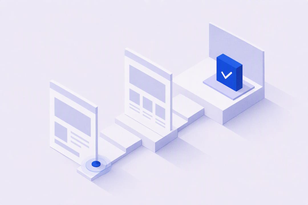
Focus on one high-traffic page, fix its mobile speed and form friction, then run a single A/B test on the biggest suspect. That combination usually delivers the fastest measurable uplift for a small site. Pick your homepage or top landing page right now, load it on your phone with the WiFi off, and count how long it takes to appear. If it feels noticeably slow to load or the form asks for more than a handful of fields, you’ve found your starting point.
TL;DR:
- Fixing slow mobile load speeds and reducing form fields typically deliver quick gains, especially when combined with a single high-impact A/B test.
- Focus on one specific page, a clear hypothesis, and impactful changes like matching headlines or simplifying forms before considering a complete redesign.
- Use a small tool set—GA4, heatmaps, and A/B testing—to identify and validate the biggest conversion leaks efficiently.
- Personalise messages based on visitor type or source carefully, avoiding intrusive tactics, to increase relevance and trust.
- Implementing these tactics in a two-week cycle can produce measurable improvements, with quick wins often coming from minor but focused optimisations.
Table of Contents
- How to improve website conversions the right way
- Audit the funnel: quick checks to find the biggest leaks
- Quick wins: tactical changes that most often lift conversions
- Designing and prioritising A/B tests
- The small tooling stack that covers most needs
- Persuasion tactics that respect a sceptical audience
- A single sprint: step-by-step checklist to run one improvement cycle
- Personalisation techniques to tailor user experience
- Segmentation and targeting for different audience groups
- Improving the journey beyond the landing page
- How Basic-bs applies these tactics in practice
- How Basic-bs can help you put this into practice
- Sources
- FAQ
How to improve website conversions the right way
Most small business owners think improving website conversions means a full redesign. It rarely does. It means picking one metric, one page, and one change, then measuring honestly.
Primary conversions are the thing you actually want: a purchase, a booking, a signed contract. Micro-conversions are the smaller steps that lead there, like a newsletter signup, an added-to-basket action, or a click on your phone number. A local plumber’s primary conversion might be “quote request submitted.” Their micro-conversions could be “service page viewed” or “call button tapped.”
The formula for conversion rate is simple: (Conversions ÷ Total Visitors) × 100. If 2,000 people visit your site in a month and 50 request a quote, that’s a 2.5% conversion rate. Whether that’s “good” depends heavily on your sector and traffic source, and generic industry averages are often not relevant. What matters more is your own trend line.
Set a short target instead of a vague ambition, based on your own prior performance and realistic improvement goals.
Tie the target to a number that matters to your bank balance. Even a small lift can meaningfully improve your returns when considered alongside average order value and traffic volumes.
Audit the funnel: quick checks to find the biggest leaks
Before you touch a single word of copy, find out where people are actually giving up. Guessing is how businesses waste months tweaking button colours while the real problem sits three steps earlier in the checkout.
- Pull your GA4 funnel and behaviour reports first. Look for the single step with the sharpest drop in visitor count. That’s your priority page, not the one you personally dislike the look of.
- Layer in a heatmap and session replay tool. Watch for rage clicks (repeated frantic tapping, usually a sign something looks clickable but isn’t), U-turns (visitors landing and bouncing straight back), and how far people actually scroll before giving up.
- Run the five-second test. Show the page to someone unfamiliar with your business for five seconds, then ask what the business does and what they’re meant to do next. If they hesitate, your headline and call to action aren’t doing their job.
- Load the page on a cold mobile browser. Not on your office WiFi with the site cached. Turn off WiFi, use mobile data, and time it. This is where a lot of businesses get an uncomfortable surprise.
- Count form fields and check tap-target size. Anything asking for more than five fields on a first contact form is bleeding people, and buttons smaller than a thumb tip on mobile cause mis-taps and frustration.
Combining funnel data with heatmaps and replays turns “something’s wrong here” into “this specific thing is wrong, on this specific step,” which is what actually lets you fix it instead of redecorating around it. That approach of pairing quantitative and qualitative signals is standard practice in conversion audits, and for good reason: numbers tell you where, replays tell you why.
Mobile deserves special attention here. It now accounts for the majority of global web traffic in most regions, so any audit that treats mobile as an afterthought is auditing the wrong version of your site.
Quick wins: tactical changes that most often lift conversions
These are the fixes that tend to move the needle fastest, roughly in order of typical impact versus effort. None of them require a rebuild.
- Match your headline to the ad or link that brought people there. If your Google ad says “same-day boiler repair,” your landing page headline should echo that exact promise within the first line. A mismatch makes visitors think they’ve landed in the wrong place and they leave within seconds.
- Make one CTA the obvious CTA. Not three competing buttons in different colours. One clear, benefit-led action, phrased as what the visitor gets (“Get your free quote”) rather than what you want (“Submit”).
- Put trust signals right next to that CTA, not buried in a footer. A specific number, a named client outcome, or a Google rating with a review count works far better than generic praise like “trusted by many.” Vague testimonials read as filler; specifics read as proof.
- Cut your forms down to the essentials. Every extra field is a chance for someone to abandon. Use autofill-friendly field names and the correct mobile keyboard type (numeric for phone numbers, email keyboard for email addresses). If a form genuinely needs to be long, break it into short steps with a visible progress indicator.
- Design for thumbs, not mice. Put your primary CTA where a thumb naturally rests on a phone, keep tap targets generously sized, and give buttons breathing room so nobody hits the wrong one by accident.
- Fix your load speed before anything else. Compress images, defer scripts that aren’t needed immediately, and lazy-load anything below the fold. A slow page undoes every other fix on this list before a visitor even reads your headline.
- Use single-purpose landing pages for campaigns. A homepage tries to serve everyone; a campaign page should serve one visitor with one intent and one action. High-converting landing pages focus on a single visitor intent, stripping out the navigation menu, the extra links, and anything that competes with the main action.
- Show pricing honestly, with monthly and annual options side by side. People trust businesses that don’t hide the number until step four of a form. An honest anchor (showing the higher price crossed through, or comparing monthly versus annual savings) helps people decide faster, provided the comparison is truthful.
Pro Tip: Before rewriting a whole page, try just swapping the headline and the CTA button copy for one week. These two elements often carry more weight than the rest of the page combined, and testing them first tells you fast whether deeper work is even worth the effort.
A short checklist of homepage fixes, like removing slow autoplay slideshows and stating clearly what you do within the first screen, is consistently flagged in practical CRO reviews as an easy, high-return win that small teams overlook simply because they’re too close to their own site to see it.
Designing and prioritising A/B tests
Running a test without a hypothesis is just fiddling. Write the hypothesis down before you touch anything:
Because we observed [drop-off point from your audit], we will change [specific element] to achieve [expected outcome], measured by [specific metric].
For example: “Because we observed 68% of mobile visitors leaving the quote form after the third field, we will reduce the form to two fields on step one, to achieve a higher form-start-to-completion rate, measured by GA4 conversion events.”
Once you’ve got a list of possible tests, score each one to decide what to run first:
- Impact: how much could this realistically move your conversion rate if it wins?
- Confidence: how strong is the evidence behind this idea (audit data, industry precedent, common sense)?
- Ease: how quickly and cheaply can you build and launch it?
Score each from 1 to 5, add them up, and run the highest-scoring test first. This ICE approach stops you chasing the test that’s most fun to build rather than the one most likely to pay off.
A few rules to stop the test producing junk data:
- Change one meaningful variable at a time. Changing the headline, the CTA colour, and the image together tells you nothing about which one actually mattered.
- Give the test a minimum run time, generally at least one to two full weeks, to smooth out weekday and weekend behaviour differences.
- Decide your primary metric (the one that decides win or lose), a secondary metric (extra context), and a guardrail metric (something that shouldn’t get worse, like average order value) before launch, not after you’ve seen the results.
Structured testing like this is repeatedly identified as one of the most reliable ways to raise conversion rate without the guesswork that comes from redesigning on instinct alone.
The small tooling stack that covers most needs
You don’t need a dozen platforms. Three tools, used together, cover almost everything a small business needs to diagnose and validate a conversion problem.
- GA4 for funnel visualisation and finding exactly where visitors drop out of your journey.
- A behaviour tool such as Microsoft Clarity or Hotjar for heatmaps and session recordings, showing you the “why” behind the GA4 numbers.
- A simple A/B testing tool to run controlled experiments once you have a hypothesis worth testing.
The real skill is combining them rather than treating each as a standalone report. If GA4 shows a drop on the checkout step, check the heatmap for that exact step before assuming you know why. Watch a handful of session replays of visitors who dropped off there. Nine times out of ten, the pattern is obvious once you’ve watched three or four real people struggle through it.
Watch out for these interpretation traps:
- Declaring a winner too early. A test that looks 20% better after two days can easily flip by day ten once enough traffic has passed through.
- Ignoring weekday effects. B2B sites often convert differently on a Tuesday than a Saturday; running a test for only four days risks catching a skewed slice of the week.
- Seasonal skew. A test launched the week before Christmas won’t tell you much about normal March behaviour.
- Losing sight of guardrail metrics. A form that converts more because you removed a required field might also be filling your inbox with unqualified leads.
Persuasion tactics that respect a sceptical audience
Behavioural science works, but heavy-handed pressure tends to backfire with UK audiences, who generally respond better to transparent evidence than to a hard sell.
- Use concrete social proof, not vague praise. “4.8 stars from 212 reviews” beats “loved by our customers” every time, because it’s checkable and specific.
- Anchor your pricing honestly. Showing a full price alongside a discounted or annual rate helps visitors judge value quickly, provided both figures are genuine.
- Only use scarcity when it’s true. “Only 2 slots left this month” is a strong lever precisely because it’s rare and honest; faking it erodes trust the moment a visitor spots the same message three weeks running. Claims and urgency messaging should stay within the CAP Code advertising standards that govern misleading claims in UK marketing.
- Add short reassurance near the CTA. A line like “We respond within one working day” or a link to your privacy approach reduces the hesitation that stops a finger hovering over the submit button.
Behavioural levers like anchoring and social proof genuinely move conversion rates when applied ethically and tested properly, rather than bolted on as decoration.
Applied well, these techniques nudge a decision that was already leaning your way. Applied badly, they read as manipulation, and cautious buyers notice the difference fast.
A single sprint: step-by-step checklist to run one improvement cycle
Here’s a realistic two-week cycle a busy owner or a small team can run without derailing everything else on the to-do list.
- Day 1: Pick the page with the worst drop-off from your audit. Pull the relevant GA4 data and watch five to ten session replays. Write your hypothesis using the template above.
- Day 2: Design the variation. Keep it focused, changing the one variable your hypothesis names. Check it on at least three real devices, prioritising mobile first.
- Days 3 to 14: Launch the test and leave it alone. Resist the urge to check hourly and call it early. Monitor for anything broken, but let the agreed run-time play out in full.
- After the test: If there’s a clear winner, implement it as the new default and move straight to the next test on your prioritised list. If the result is inconclusive, note down what you learned and refine the hypothesis rather than abandoning the idea entirely.
Pro Tip: Keep a simple running log of every test, win or lose. A “failed” test that shows a benefit-led CTA didn’t beat a plain one is still useful data. It stops you or a future hire testing the same dead end twice.
Personalisation techniques to tailor user experience
Personalisation doesn’t have to mean building a machine-learning recommendation engine. For most small sites, it means showing the right message to the right visitor based on something you already know about them.
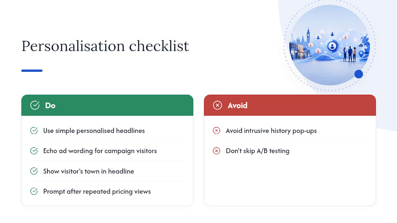
Returning visitors can see a different headline to new ones, something like “Welcome back” paired with a nudge toward the page they viewed last time. Visitors arriving from a specific ad campaign can land on copy that echoes that exact campaign’s wording rather than a generic homepage message, closing the gap between what they clicked and what they see.
Location-based personalisation works well for service businesses. A plumber covering three towns can show a headline referencing the visitor’s nearest town, based on IP location, which reads as more relevant than a blanket “Serving the whole region” line.
Even simple behavioural personalisation helps: a visitor who has already viewed your pricing page twice is closer to a decision than someone landing for the first time, so a follow-up prompt like “Ready to get a quote?” fits them better than a general introduction. The trick is restraint. Over-personalising with intrusive pop-ups that reference browsing history too explicitly tends to unsettle visitors rather than reassure them. Start with one or two light-touch personal cues, test whether they actually improve conversion, and expand from there.
Segmentation and targeting for different audience groups
Not every visitor wants the same thing from your site, and treating them identically wastes the effort you’ve put into fixing the page.
Split your traffic into meaningful groups before deciding what to change. New versus returning visitors is the simplest starting segment. Someone landing for the first time needs context and trust signals; someone who’s visited three times already knows who you are and just needs a nudge to act.
Traffic source is another useful split. Visitors from a paid search ad usually arrive with high intent and a specific need in mind, while visitors from a general social media post are often browsing more casually and need more persuasion before they’ll convert. Device type matters too: mobile visitors researching on the go behave differently from desktop visitors filling out a longer form at their desk.
For B2B or service businesses, segmenting by customer type pays off directly. A landscaping company might have domestic customers and commercial property managers landing on the same site with entirely different budgets and decision timelines. Serving them the same generic page, rather than tailoring the language and case studies each group sees, leaves value on the table.
You don’t need complex software to act on this. Even something as simple as separate landing pages for each traffic source, each written in the language that source’s visitors expect, counts as effective segmentation and usually beats a single page trying to speak to everyone at once.
Improving the journey beyond the landing page
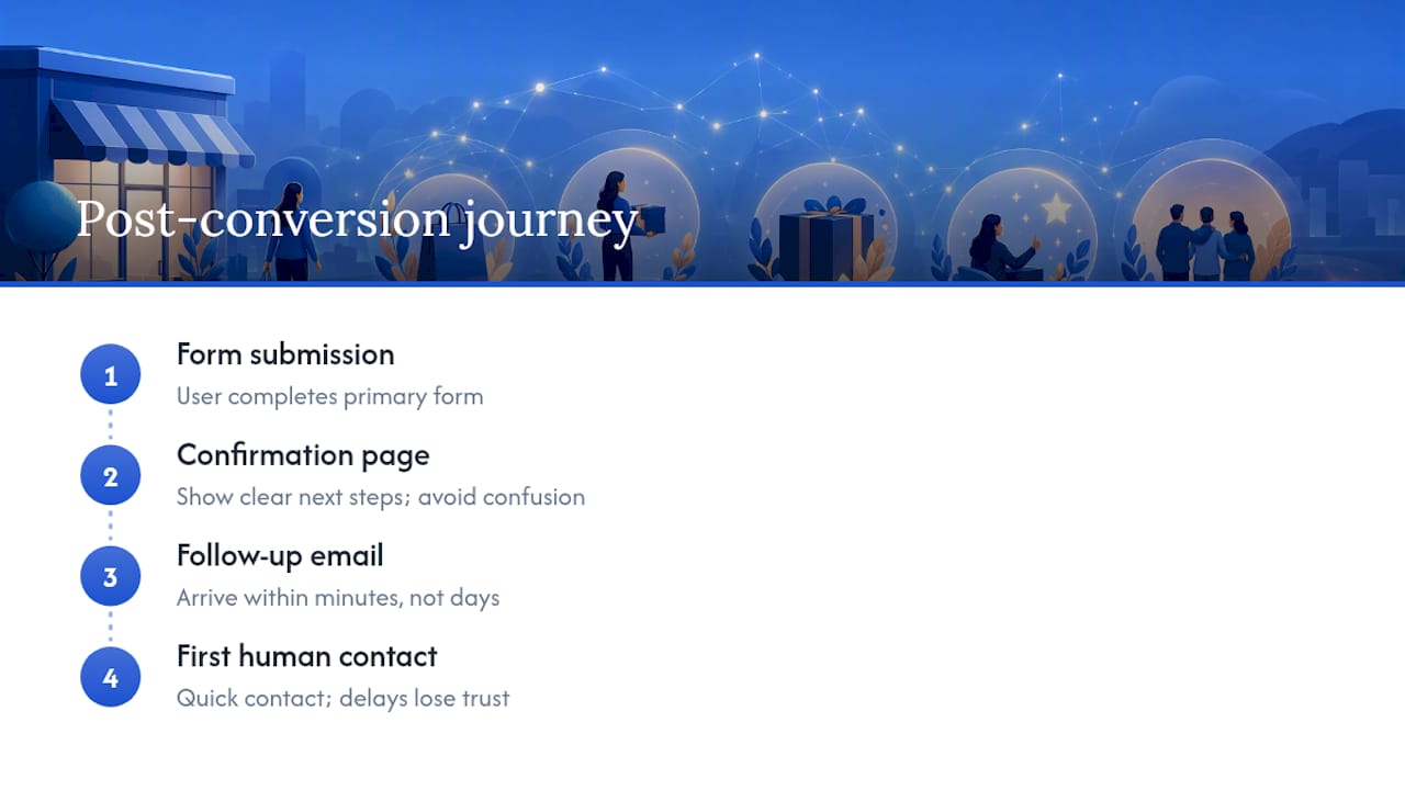
Conversion optimisation often stops at the landing page, but the journey afterwards matters just as much for revenue. A visitor who converts on your form but then has a confusing “thank you” page, or receives no confirmation email for hours, starts doubting a decision they’d already made.
Map what happens immediately after the primary conversion. Does the confirmation page set clear expectations about what happens next? Does the follow-up email arrive within minutes rather than the next day? These moments shape whether a lead stays warm or goes cold while you’re still congratulating yourself on the form completion.
For ecommerce sites, the post-purchase journey deserves the same scrutiny as the product page. Order confirmation clarity, shipping expectation accuracy, and how quickly a customer can find help if something goes wrong all affect repeat purchase rates, which matter more to long-term revenue than the first sale alone.
For service businesses, the gap between “form submitted” and “first human contact” is where trust is won or lost. A visitor who fills in a quote request and hears nothing for three days has effectively been told their business doesn’t matter much, whatever your homepage claims about customer care.
Treat the full journey, not just the entry point, as part of your conversion funnel. A page that converts brilliantly but feeds into a weak follow-up process is solving only half the problem.
How Basic-bs applies these tactics in practice
Small businesses rarely have the time to run structured tests alongside actually running the business, which is a common challenge many face. An approach that bakes AI search optimisation and ongoing monthly updates into every build can help, rather than treating a website as a one-off project that gets ignored after launch. Full details of the website build and AI training service sit alongside the managed hosting we run for every client.
DIY testing suits you if you’ve got the traffic volume to reach meaningful results within a week or two and someone in-house comfortable reading GA4. If your traffic is modest, your time is scarce, or your last “quick fix” turned into three unplanned weekends, that’s usually the signal to hand the sprint to someone else rather than let it stall.
— Conor
How Basic-bs can help you put this into practice
Rebuilding a slow, form-heavy site yourself eats weekends you don’t have, and hiring a traditional agency often means a lengthy proposal process before anything even goes live. Plans start from £39.99 a month, with no upfront fee, and new builds can go live quickly, built to prioritise mobile speed and clean CTA structure as this article has been arguing for.
That suits two kinds of reader particularly well: small business owners who know their current site is costing them enquiries but haven’t got the hours to fix it themselves, and event organisers who need a password-protected site live fast without wrestling with page builders. Each build includes managed UK hosting with SSL and ongoing monthly updates, so the conversion sprint described above doesn’t die the moment the site goes live.
Read more on why cheap website builds often fail before you compare options, then take a look at Basic-bs’s own plans and run your first five-second mobile test the week your new site launches.
FAQ
Is a 12% conversion rate on a website good?
Compare it against your own historical baseline rather than a generic benchmark, since conversion rate varies enormously by industry and traffic source.
Is 2.5% a good conversion rate?
A 2.5% conversion rate sits close to what many small business sites see, so it’s reasonable rather than outstanding. Whether it’s “good” for you depends on your average order value and whether that rate is trending up from your own baseline.
What are the 7 Cs of a website?
Definitions vary across marketing sources, but a commonly cited version covers clarity, consistency, credibility, content, convenience, call to action, and conversion. Treat it as a general checklist rather than a strict standard.
What are the core principles behind improving conversion rates?
The consistent themes across CRO practice are clarity of offer, trust, ease of action, speed, and evidence-based testing rather than guesswork. Focusing a single page on one visitor intent and one clear CTA, backed by structured testing, covers most of what matters.
How quickly can changes to a website start improving conversions?
Simple fixes like shortening a form or clarifying a CTA can show measurable movement within the two-week minimum run time recommended for most A/B tests. A managed build through a service like Basic-bs can have a fully optimised site live within five to seven working days, giving you a faster starting point for that first test.